Unveiling the Secrets of Minimalist Typography
Typography plays a crucial role in design, as it sets the tone and conveys the message of a visual piece. From advertising to web design, typography can make or break the overall experience. In recent years, minimalist typography has gained significant popularity, known for its clean, simple, and stylish approach. In this blog post, we will delve into the secrets behind minimalist typography and uncover why it has become a favorite among designers.
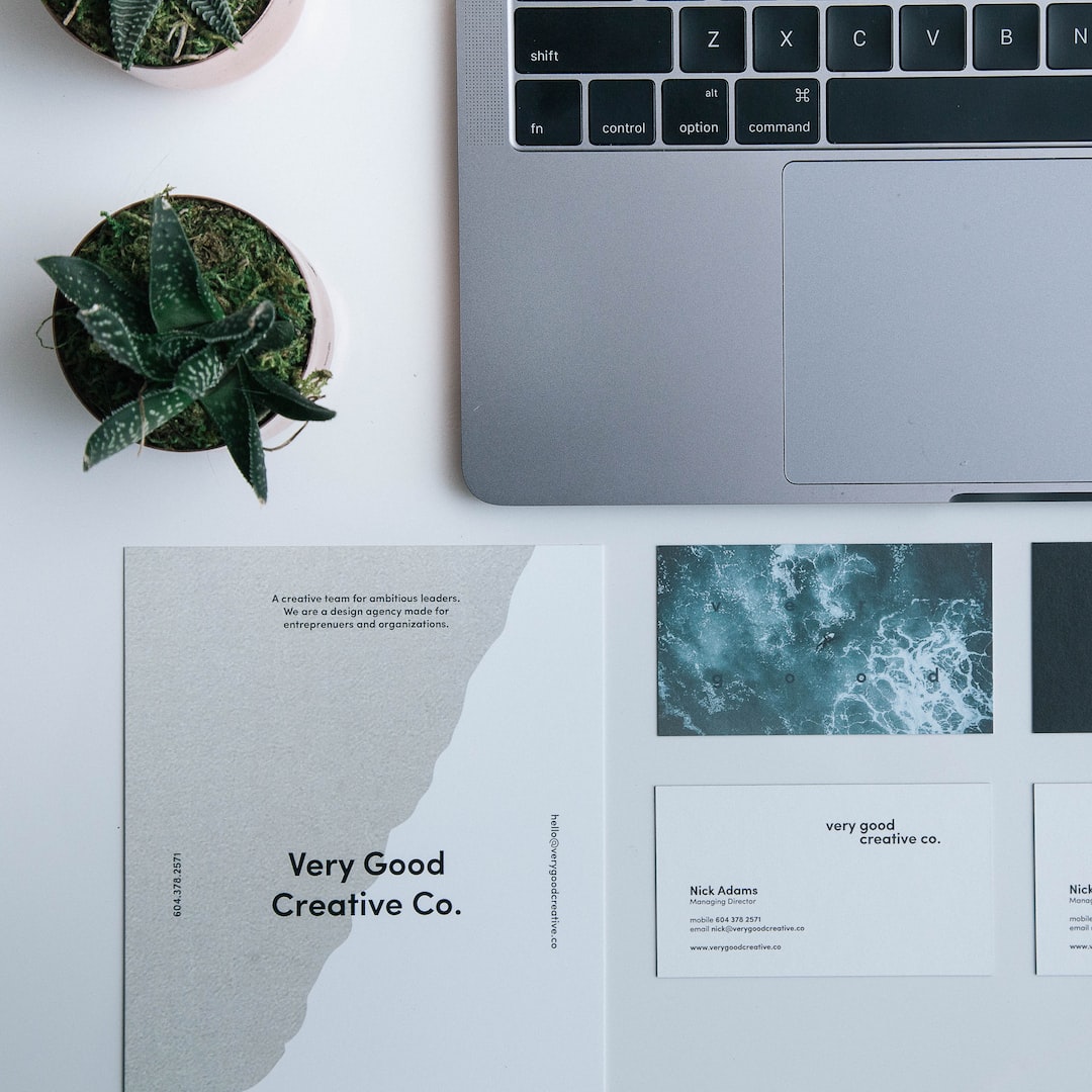
One of the key aspects of minimalist typography is the use of simple and straightforward typefaces. Sans-serif fonts, in particular, are often preferred as they have a smooth and clean appearance without any decorative elements. Fonts like Helvetica, Arial, and Futura are commonly used in minimalist designs, as they convey a sense of modernity and simplicity. By removing unnecessary embellishments, minimalist typography focuses on the essence of the message, allowing the content to shine through.
Another secret to achieving effective minimalist typography is the careful selection of font weights and sizes. Minimalist design relies on creating hierarchy and emphasis through the use of contrasting weights and sizes. For instance, a bold and large title font can be paired with a lighter and smaller body font to create a clear distinction between different sections and emphasize important information. This strategic use of font weights and sizes adds visual interest to the design while maintaining its simplicity.
Whitespace, or negative space, is a fundamental element in minimalist typography. It refers to the empty areas surrounding and between the letters and words. Whitespace helps to enhance readability and allows the design to breathe, making it more visually appealing. By incorporating ample whitespace, minimalist typography creates a sense of calmness and elegance. It also allows the viewer’s eyes to focus on the actual content, without any distractions.
Maintaining consistency is essential in minimalist typography. Consistency in font choices, sizes, and spacing creates a cohesive and harmonious design. When using multiple typefaces, it is important to ensure that they complement each other and contribute to the overall aesthetic. Consistent spacing between letters and lines also helps to create balance and readability. Minimalist typography is all about keeping things simple and unified, resulting in a pleasing and sophisticated visual experience.
Color selection plays a crucial role in minimalist typography. Limited color palettes are often favored, with black and white being the go-to choices. By sticking to a monochromatic or restrictively limited color scheme, minimalist typography allows the focus to remain on the form and content of the typography rather than the colors themselves. However, minimalistic designs can make use of subtle pops of color to draw attention to specific elements or add a touch of personality.
In conclusion, minimalist typography is all about stripping down to the essentials and letting the content speak for itself. It combines simplicity, clarity, and elegance to create visually stunning designs. The use of sans-serif fonts, careful selection of font weights and sizes, whitespace, consistency, and color choice all contribute to achieving a successful minimalist typography. By understanding and implementing these secrets, designers can create captivating and impactful designs that communicate effectively and leave a lasting impression.
